It’s hard to imagine two more different places than casinos and grocery stores. One is a place we might go once in a while for a fun night on the town and the other is a chore to add to our to-do list.
Featured Image VIA
These two locales, however, have more in common than you might think. The designers of both have delved deep into the human psyche to determine the most evocative and powerful stimuli for keeping people in their establishment as long as possible.
It’s all about that upsell and increased consumer spending. Using a clever combination of the ideal customer journey, potent sensory triggers, and a complete experience (rather than ad hoc activities), casinos and shopping centres are working hard to make sure you stay longer.
Layout ideas

A mindful layout
When you step into your local grocery store, you may notice how time doesn’t seem to pass at all and you really have no clue what time it is or how long you’ve been there. This is all by design.
Just like in a casino, there are purposefully no windows in the building (except the front doors) and not a clock to be found on their four walls to give the illusion of time standing still. This is not by accident either. The longer you stay in the casino or the grocery store, the more money you will spend.
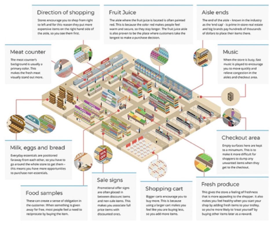
Wander deep into the store, maybe even all the way into the back to find the eggs, milk, bread, and other pantry staples, which are tucked away as well as separated from each other in order to get customers to spend longer in the store. This calculated arrangement counts on patrons making impulse purchases along the way, even if their intention was only to buy a loaf of bread.
Casinos utilize this method as well, hiding the cheaper-play slot machines in the very back, forcing players to make their way through the glitz and glamour of higher-priced games on their way there. With distractions galore, the odds are definitely in their favour that most people won’t even make it to the cheap section at all.
Demographics
Women like a quieter, more relaxed environment. Casinos take this into account by placing the games geared toward women in a more peaceful area that is separated from the highly trafficked games and paths.
Younger gamers are more social and like to chat with their friends. In order to accommodate the whims of a changing demographic, casinos have clustered machines in little social groups, rather than long lines, to allow for gamers to communicate while trying their luck.
As the traditional group of gamblers age and a new generation finds its way to the gaming floor, casinos have upped the ante in a variety of ways. From improved wi-fi to convenient phone charging stations near machines, casinos are now well equipped to keep patrons playing as long as possible.
Local shopping centres have taken a page out of this marketing book as well. The addition of a coffee kiosk or fast food establishment near the entrance of the building gives shoppers something to sip while they browse and the boost, they need to keep shopping longer.
All the Bells and Whistles
It’s no accident that all five human senses are used and exploited in both shopping and gaming arenas. From the moment you walk into your local grocery store, your eyes are drawn to the colourful produce that’s positioned right near the front entranceway.
As you make your way further into the store, you’ll smell the delightful scents of the bakery or the pre-made rotisserie meats in the butcher section.
Both grocery stores and casinos take full advantage of customers’ auditory senses as well. In a recent study, the American Marketing Association found an increase of 38% in customer spending at grocery stores where music was playing versus those without.
Whether it’s relaxing and lively music or announcements of deals and events, sound is an important part of keeping people engaged in these two locales.
Even slot machines still make a sound like the cascade of coins you’d hear during a big win — despite the fact that casinos have since switched to paper vouchers and no longer use coins to keep track of players’ winnings.
Despite the many similarities, a huge difference is the lighting. I highly doubt casinos would do half as well with harsh fluorescent lighting. The same goes for grocery stores — it’s hard to imagine a dimly lit space for picking out fruits and vegetables.
Extend the Experience
All this just goes toward reinforcing the notion that keeping a customer or player inside and occupied for as long as possible is the goal. The design and techniques are ever-changing and ever evolving to keep up with the changing tastes and impulses of their clientele.
Casinos have come a long way in recent years. Long gone are the days of dingy, dark spaces full of identical slot machines. If you haven’t visited a modern casino recently, we suggest you do so soon as they may be a thing of the past as new casinos move online.
It may not always be the case that casinos and grocery stores follow the same design trajectory but for recent decades that has been the trend. It will be fascinating to see what the future of shopping and gaming holds in store.


