Movie posters are cool, which is why so many people have them hanging on their walls with blu tack at uni and then framed later on when they grow up and move into a real pad.
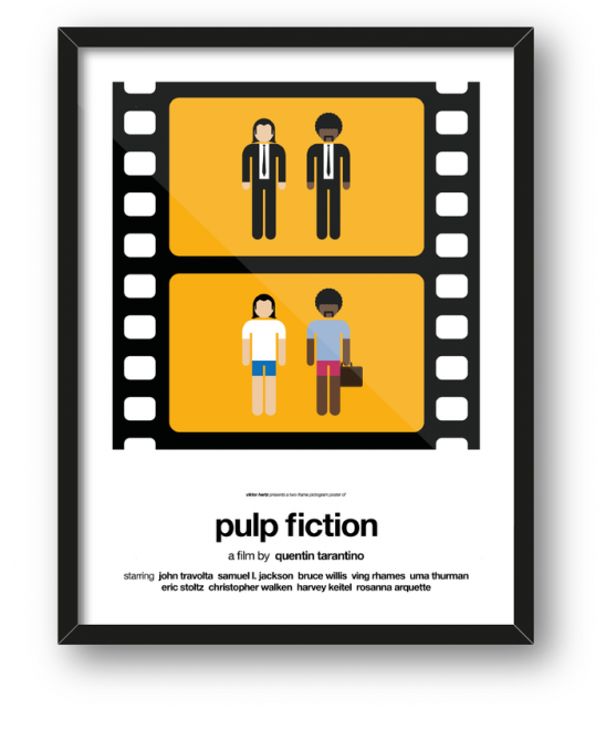
What’s cooler than having movie posters on your wall though is having movie posters that are completely different to what everyone else has, which is why these minimalist posters from Viktor Hertz stand out as being so awesome. The idea is that he’s depicted two scenes from each of the movies that sum up the journeys of the characters through it and for the most part it works perfectly. He explains the idea in his own words:
I’ve been working with pictograms since I started doing graphic design. However, this time I wanted to come up with a completely new concept– so, I tried to depict movies in just two still frames. Think of it as an extremely short film, summarizing the story and visualizing the changes the characters go through.
You can see all the posters on the following pages, including The Big Lebowski, Pulp Fiction and the Star Wars trilogy. If you like what you’re seeing, head on over to his Kickstarter to help Viktor out. He wants to get all the paintings printed out so if you throw him some bones I’m sure one could be hanging on your wall very soon and you would be the envy of all your friends.
If you enjoyed these posters then check out these Ghanaian movie posters that don’t bear any resemblance to the movie they’re even advertising half the time.


