The posters for the London Olympics 2012 were released on like Friday or something but I was otherwise engaged so sorry if you’ve already seen them. I’m gonna paraphrase this before I go on a massive rant about how retarded they are by saying I am in no way an art critic – I mean I like comic books sure but I’m pretty sure that comic books are regarded in the art world like pop punk is regarded in the hipster world, and I recently pretty much got dumped for refusing to go to art galleries with my girlfriend – so my opinion might not be as valid as the more creative among us, but surely someone else must think that these posters are kinda crappy and look kinda like they might have been designed by some small children or something?
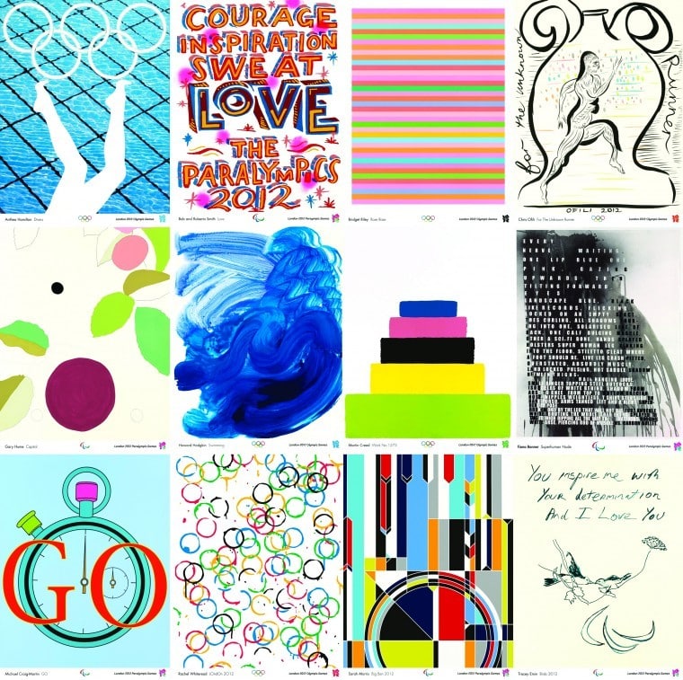
I wanted to post all of the different posters and make them quite big so I could rip each of them to shreds about why I hated them but I could only find this montage of all of them so apologies about that, I think it should be big enough to get my point across though. I mean look at them. Sure, they’re all kind of colourful but they all look so basic and stupid and babyish. I don’t really follow the Olmypics and/or care about them but I remember watching them on TV in other countries and the art/displays looked a lot better than this. Like vaguely impressive/grandiose or something. You know, in fitting with a grand occasion like the Olympics. These posters look like they are advertising a local village craft fair or fete or something. They look crap.
Take the one that says ‘Courage, Inspiration, Sweat, Love – The Paralympics 2012.’ It looks like a birthday card you get for your kid sister that has a crappy joke in it. If I was disabled and in the Paralympics I think I might find such a poster condescending; I mean I might be disabled but that doesn’t mean I want to be treated like a baby, surely that is the whole point of the Paralympics and I don’t think making posters like that is really in keeping with that?
The other posters aren’t much better. I recognise this is an age of hip conceptual art or whatever, but a series of different coloured lines (which are the basis of at least two of the posters) doesn’t really scream out Olympics to me, or really do anything to help advertise or celebrate the occasion. They just suck and probably wouldn’t even get a C grade at GCSE art, even if you showed a good development of your ideas. The one that’s a dark to light blue swirl as well, that’s just swell. I don’t even really need to say anything about that. It looks like a finger painting I did when I was five that completely sucks but for some reason my parents have framed somewhere in their house.
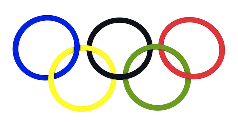
I guess a couple of them are OK. The one with the stop watch that has GO written over it is OK but again looks more like it is suited to advertising some really old cartoon series like Mr Ben or William’s Wish Wellingtons or something rather than the Olympics, you know? The one with the legs and the Olympic rings is probably my favourite. I mean, it’s got the Olympic rings – so you know it’s actually advertising the Olympics – and some legs and a swimming pool, so you know it kinda sums up the event. The same goes for the one with all the rings on. It looks a little messy but at least you know it’s actually advertising the Olympics.
That might be my main gripe with a lot of these posters, as you don’t actually realise that any of them are even advertising the Olympics unless you look really closely at the bottom of the poster. I don’t even want to talk about the posters that I haven’t mentioned. What the hell is going on in any of them? The one with some leaves on and a purple ball!? The one with a dumb looking guy running in a vase? Don’t get me started. Just what are they supposed to represent? Why have they been chosen to represent the London 2012 Olympics? Don’t people realise that every other country in the world is going to be laughing at us?
These posters suck and I can only hope that aren’t foreshadowing the actual Olympics themselves and how much of a mess they could turn out to be. Because I’m obviously really excited about them too.
