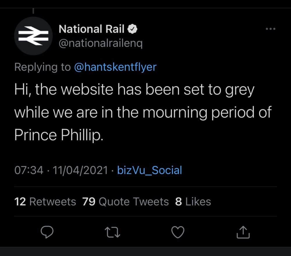
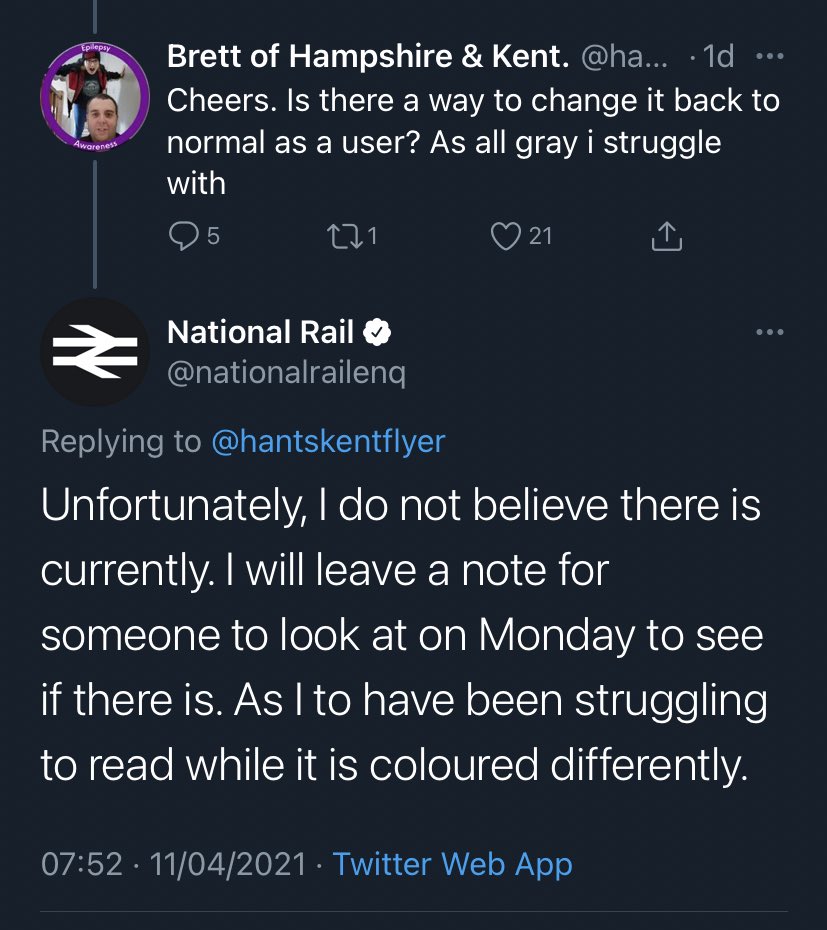
Prince Philip and DMX both sadly passed away on Friday and both of them have had numerous tributes paid to them over the weekend, the dumbest of which has to have come courtesy of National Rail who decided to turn their website grey in an attempt to honour Prince Philip.
Featured Image VIA
That all sounds well and good, but sadly whoever turned the website grey didn’t think about how this would affect its functionality and it was pretty much unusable for the entire weekend. Of course, this also meant that National Rail were roundly rinsed over the weekend as well and it became even more embarrassing for them when whoever runs their social media accounts also agreed that the website was a lot more difficult to see with this colour scheme.
They also spelled Prince Philip’s name name wrong as well so it was pretty much a universal disaster right there. Oh well.
As a mark of respect for Prince Philip, National Rail have made their employees unable to read the National Rail timetable pic.twitter.com/yyl7OXbF5L
— James Felton (@JimMFelton) April 12, 2021


Have just seen that National Rail have turned their website black and white for Prince Philip (really bad for accessibility) but not spelled his name correctly. https://t.co/ODhtG9Rfaj pic.twitter.com/mhDyp50qQj
— Jonathan Haynes (@JonathanHaynes) April 12, 2021
Many thanks to National Rail for making all my future talks on why senior staff need to understand digital accessibility much, much easier. pic.twitter.com/5HVcbiHK8i
— John Bull (@garius) April 12, 2021
National rail have coloured their entire website grey to “mourn Prince Phillip”, rendering the whole website completely useless to people with visual impairments. The UK has completely lost the plot pic.twitter.com/5OKWAFXDWR
— socks is socially distancing (@carseatarmrest) April 11, 2021
National Rail greyscaled their website to mourn the death of Prince Philip and its causing utter chaos for the visually impaired. Its what he would have wanted I guess. pic.twitter.com/zMfFC9ZpBD
— Beeb (@ybees3) April 11, 2021
This whole National Rail goes black thing is a good example of quick hacks being awful.
Compare the National Rail to Gov, both gone black but one far more accessible than the other. One properly designed, the other a colour website with greyscale filter. pic.twitter.com/1SX40G5k5i
— Shane Hudson (@ShaneHudson) April 12, 2021
Did you know you can pay respect to someone who had passed away without turning your website into an ableist hellhole? #NationalRail
— Danielle Roe 🏳️🌈 (@DJROE95) April 12, 2021
What a colossal failure all around there hey? Can’t actually believe that someone thought that would be a good idea and then went home for the weekend and didn’t do anything to sort it out. I guess that’s the remit for a website developer these days though. Think this will probably be remembered as the best tribute to Prince Philip because it’s just so stupid. Never ceases to amaze me how massive brands can screw stuff like this up all the time. Seriously.
For more of the same, check out


