Rumours about the proposed Conor McGregor/Floyd Mayweather super fight continue to lurch on with both men continually teasing us with tidbits of information via their social media accounts.
Featured Image VIA
This time it’s the turn of Floyd Mayweather who has shared a promo photograph for the fight on his Instagram account. Whilst that might normally be a reason to get excited, the fact that it’s been going on for so long now means that it isn’t really that much of an event when one of them does something now.
However, what is noteworthy is just how embarrassingly bad the poster that he’s decided to share is – it looks like he spent about ten minutes dossing around on MS Paint to make it. Is this really the brand image that a guy like Money Mayweather wants to be projecting?
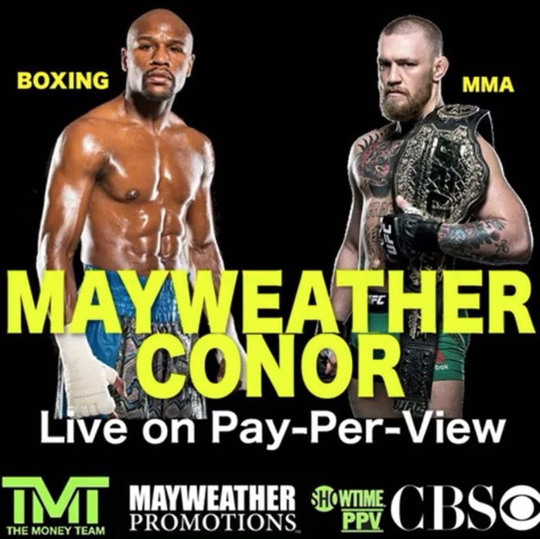
Jesus that’s pathetic isn’t it? What the hell is Mayweather thinking? It looks like the kind of event that you might see advertised down the old community hall in some shitty suburb of Doncaster or something.
And that’s not even taking into account his phrasing on there – why is he referring to himself as Mayweather but to McGregor as Conor? At least keep the thing consistent mate and use full names/surnames/first names and not switch it up like that. Just sounds stupid.
Still, however awful this is it’s absolutely nothing on how bad some of these old rave flyers are.
