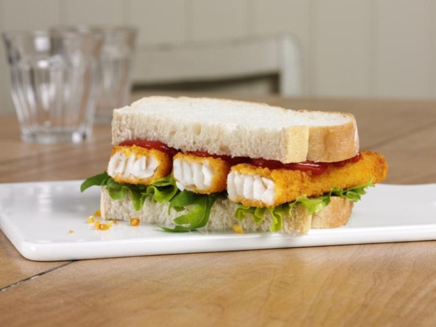
When it comes to fish finger sandwiches, there’s not really much to it – just whack your fish fingers in between a couple of pieces of bread and that’s that. Maybe toast the bread and put some ketchup or mayonnaise and a bit of lettuce on it if you’re feeling adventurous, but that’s pretty much it. Job done – it’s not really the kind of sandwich that you’re gonna spend ages mincing around with putting extra toppings on it. It just isn’t.
Featured Image VIA
That is unless you’re working for Birds Eye at the minute. They’ve unveiled a new advert for their fish fingers with the most ridiculous looking fish finger sandwich I think I’ve ever seen. Even if you ordered a fish finger sandwich in a Michelin Star restaurant I don’t think it would look like that.
I mean what the heck is with all the extra toppings? Who would ever want to put olives on a fish finger sandwich? Jalapeños? Peppers? Tomatoes? No no no, that is not what a fish finger sandwich is about. It should be simple and easy like the one below:

What more do you want from a fish finger sandwich? Certainly not fucking jalapeños and olives, that’s for sure, no way. Absolutely ridiculous.
The obvious side effect of that advert too is that it makes the fish fingers look like absolute trash when compared with everything else it’s got going on in the sandwich. Completely awful marketing strategy there from the boys, they should be ashamed of themselves. Moronic.
For more weird food, check out the world’s most disgusting delicacies. Not a patch on this though, mind.


