This is completely awesome. Again, I have to give credit to the guys over at Buzzfeed who designed this infographic that I’m blatantly pinching off them, but it is really cool and it’s exactly the kind of thing that I wish I had come up with Sick Chirpse. If only I was as smart as the guys from Buzzfeed.
Anyway, it’s a fairly simple concept but executed to perfection. Basically, you know when you’re Googling something (or maybe you’re using Bing or Yahoo or something if you’re stupid) and it will start to autocomplete what you’re writing it into the box? Most of the time it gets it right sure, but every now and again it comes up with something really stupid in there rather than anything actually resembling anything that people would actually type. Or so you would think anyway because I guess for it to come up like that then people must have typed it in the first place. People are weird huh?
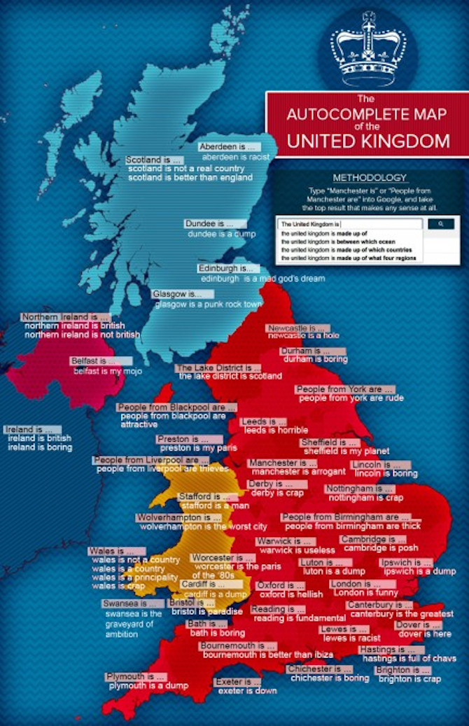
So yeah, these dudes over at Buzzfeed decided to type in every city in the UK into Google and see what some of the dumbest autocompletes that arised from this were. And boy, were there a bunch of dumb ones. Being from Birmingham originally I wasn’t really that surprised to see ‘People from Birmingham are thick’ – which is pretty much exactly how it was for the majority of my time living there – but there are some that are completely and utterly stupid, and obviously by default also really hilarious.
Classic lines on the map include stuff like ‘Sheffield is my planet’ (What?!?); ‘Wolverhampton is the worst city’ (almost true as it was voted the sixth worst place to live in the entire world a few years ago); ‘People from Blackpool are attractive’ (ummm?!?!); ‘Swansea is the graveyard of ambition’ (definitely can see what they’re saying there) and ‘Bournemouth is better than Ibiza’ (I’ve been to Bournemouth but not Ibiza. Even so I don’t really think I can agree with that because Bournemouth is pretty wank).
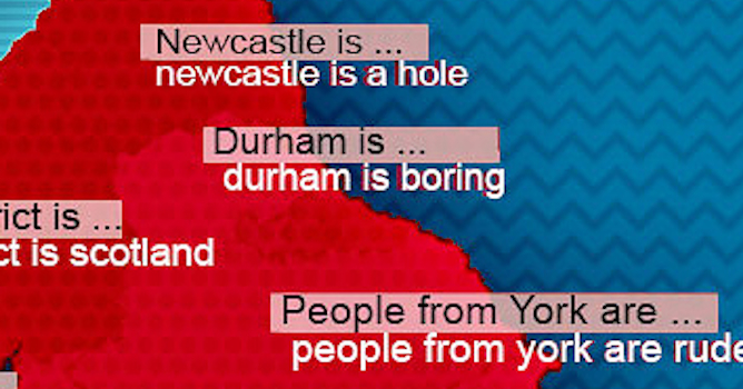
There are a bunch more on there though so take a look at the map below and enjoy them. We’re sorry about the lack of resolution on the map but we couldn’t get it into the post any other way, if you’re having trouble reading it click on it and you’ll hit up a higher quality version of it that you can zoom in on to get a better understanding of it.
☛ More Sick Infographics:
Footballers On Twitter Infographic

