You’ve come across these logos before (some are more prominent in the UK than others), but have you ever paid any real attention to the intricacies of their design?
It’s time to discover and appreciate the creativity that actually goes into the logo design of some of the most successful brands around.
Let’s go:
Amazon.com

It seems obvious now you’re looking at it, but what many don’t register right away is the arrow under the company name that begins at A and ends at Z. In other words, Amazon stock everything you need, from A to Z (also works as a sort of smiley face).
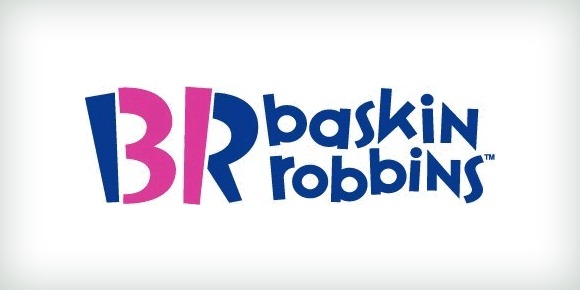
Baskin Robbins

How many flavours are available at the king of ice creams — Baskin Robbins? The answer is right there in the logo if you look close enough — 31.


