Football strips. You’ve often got to wonder how teams can actually think it’s a good idea to come up with some of the strips that they do. I mean obviously you have the iconic red of teams like Manchester United and Liverpool or the white of Real Madrid and those kind of strips are usually pretty great but they don’t really strive too far from their original remit so it isn’t actually that hard.
Even teams like Norwich with their garish bright yellow strip you have to give some credit to as they’ve managed to create a strip and colour that will forever be associated with the team. Although maybe not as much credit as it looks butt ugly and only accentuates the commolyn held perception that Norwich is a town full of pointy-headed inbred weirdoes. Props guys.
But it’s away strips where teams seem to go completely and utterly wrong with probably about 10,000 examples I can think of from the top of my head: Chelsea playing in that gross fluorescent yellow/green from a few years ago, I think it was Wigan that had some kind of fluorescent orange away strip and then there was the bright pink of my own beloved Birmingham City from last season, which my Dad actually saw fit to buy me as a birthday present – thanks for that.
I guess coaches argue that it makes the players easier to see in the hostile environment of an away match – and we all remember that Man United Southampton match eh? – but they must know that almost everyone in the world is cringing and laughing at them when they see them play on TV, and I doubt the players enjoy it too much either.
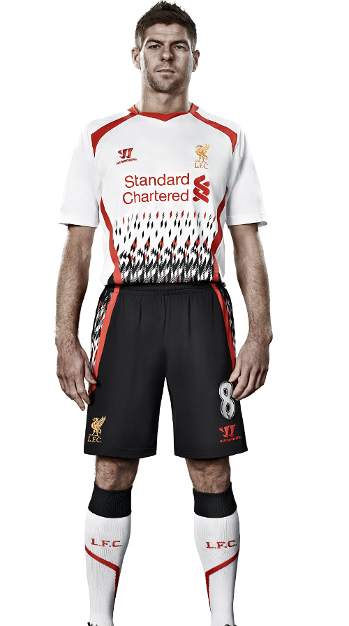
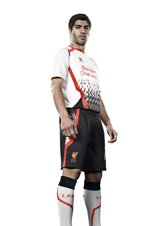
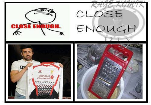
Liverpool could have topped all those strips previously mentioned with this monstrosity that they’ve recently unveiled as their away strip for the new season. I just don’t get why they would think that something like this was a good idea – I mean just keep it simple guys, there’s no need for that stupid pattern on the front? It looks like something Seth Coen from The O.C. might wear if he was into sports.
It’s just a ridiculous idea.Putting a stupid pattern on the front isn’t going to appeal to the hipster scene in Liverpool and lead to more shirt sales you know, at least not for 20 years when the item is considered ‘vintage’ so I just can’t see the point of it unless it’s a misguided attempt to be ‘cool.’ Extremely misguided.
Like I said earlier, the whole point of a football strip is to so you can easily see your other teammates so why complicate it with some crappy pattern that’s probably gonna make it HARDER to see them? It’s not the future and it definitely isn’t cool.
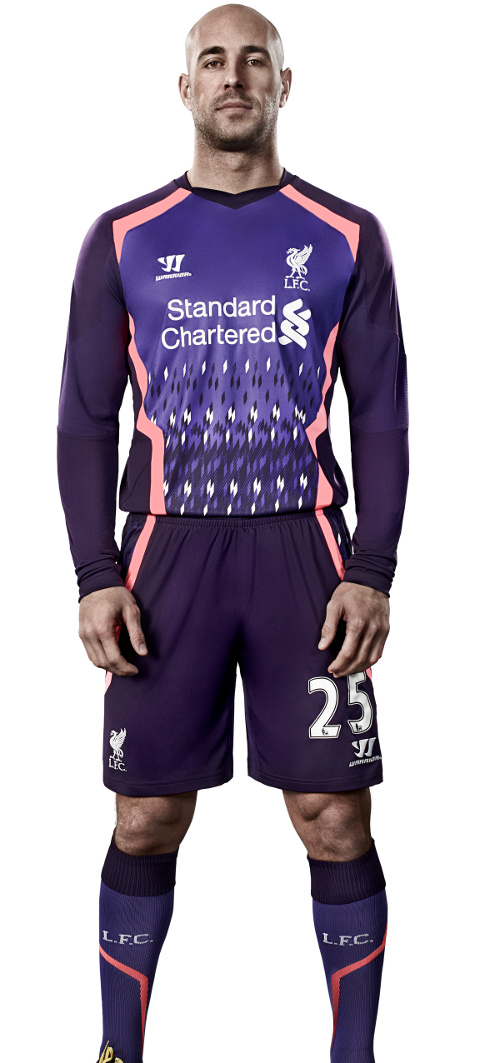
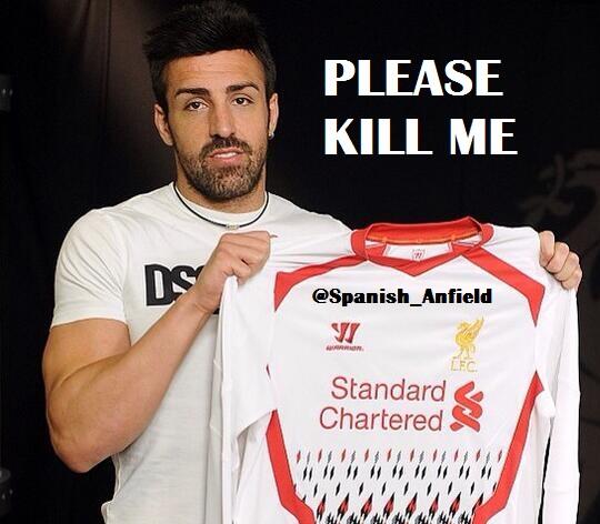
As can be expected there are already a bunch of LOLZ internet memes deriding the strip but to be honest there didn’t really need to be any as the facial expressions of the players modelling them already kind of do it for them.
Check out a bunch of them below, you’ve got to especially love the look on Gerrard and Jose Enrique’s faces (hence the memes I guess). For some reason they’ve also made a launch video which is just terrible and features a bad dubstep tune (how far are these guys behind the times, seriously?) and a bunch of lame video effects that try to make the pattern look explosive but just kind of make it look like bad CGI effects/TV static.
Thanks for the LOLZ Liverpool:
☛ More Horrible Things To Do With Liverpool:
Liverpool Strip Made Out Of Condoms
Liverpool Release The Stadium Shirt
Liverpool Fan Who Changed His Name To Fernando Torres Is Left Stunned
[yframe url=’http://www.youtube.com/watch?v=5MqZrm-p0JQ’]
