There are websites out there so great they make us ponder the meaning of life — Food on My Dog is a brilliant example. Why is it so funny? What possessed this man to put food on his dog in the first place? Will my pet python tolerate me putting food on his head? Is the sole purpose of humankind to create pictures of animals in ridiculous scenarios?
Then there are the websites that make you want to bang your head against a brick wall. They are the sites that make no sense to anyone who has ever visited a website before, or even seen a picture of a website — they are a barrage of bad design, poor content and sickening colour.
And yet, like a deluded small-town ‘singer’, they are somehow not deterred by the constant onslaught of criticism, choosing to carry on, despite being begged to stop for the greater good.
Forget the advanced shit like abandoned cart recovery, CSS and Javascript, these site owners could use a few tips on the internet in general. And possibly basic life skills in general while we’re at it.
If you think your skull can take it, here is the countdown of the 10 worst websites ever. Prepare for pain.
What is the point of this website? Since 2004, the majority of this site has been ‘under construction’ (ironic, non?) — welcome to 2012, ladies and gentlemen, where we update our websites to include useful stuff. In fact, just any stuff. Give us stuff.
9. 3D Mailbox
Because we all need Sims 1 style graphics of planes and beach scenes decorating our inbox, right? Right…? Oh hang on, that’s right, it’s pointless, and the ‘3D’ videos are migraine-inducing.
This site looks like it was designed by a six-year-old in 1995. Unfortunately, it wasn’t, and was actually being updated by a grown man all the way to 2007 with the intention of publishing and selling books of goddamn awful poetry. Tip: If no one wants to publish your writing it’s a definite sign that you should not start your own publishing company and just do it yourself. LSD is no excuse.
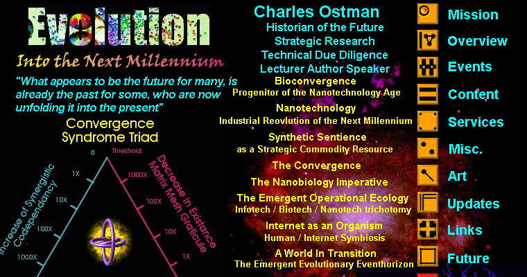
How anyone expects to be taken seriously on a page with a black background and neon writing, we’ll never know. Oh, and good luck understanding anything on this site without a PHD in Bullshit.
The internet is an incubator for conspiracy theories, and whilst some are compelling, some are just insane. Cue: Geral W. Sosbee and his “FBI and CIA are terrorists” page. It looks like it was designed by someone who belongs in a mental institution. Read the page, and you’ll realise it was.
There are some sites that are just so bad that even companies whose job it is to make bad websites work well, like Optilead, won’t touch them. This is a web hosting service, for the love of god. Why is there a credit to Macromedia when, as far as I can tell, there’s no Flash on the whole site? And the .gifs…the endless .gifs…wait! Oh my…is that a fax number?!
4. Dreams of the Great Earthchanges
On this site, you are greeted by a lovely message, stating “Please refresh your page to get the latest issue”. Isn’t it great to know that in 2012 there are still website owners out there who have absolutely no clue how the internet works? And no, I’ve not got a clue what the hell this site is about either.
3. Time Cube
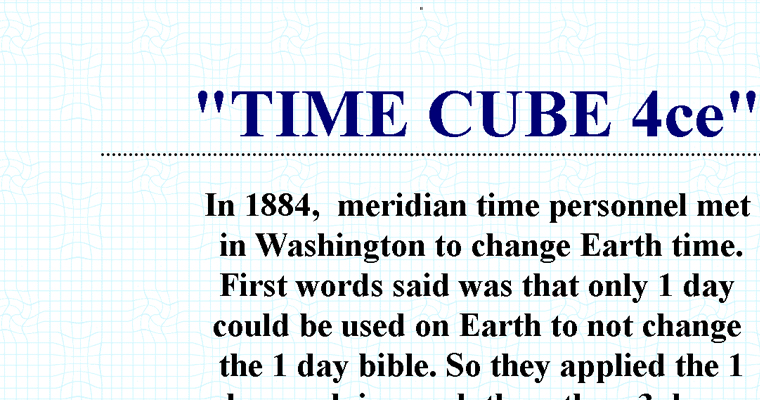
This site was composed by “Dr.” Gene Ray to attempt to explain his model of reality — the ‘Time Cube’ — and no, giant writing doesn’t help anyone understand anything beyond the first three words. Undoubtedly the highest concentration of crazy in any one man in human history, I will personally shoot whoever gave him access to a computer.
2. Dokimos
Before you click that link, I want you to know that this site is going to make you sick with both design and content (aim towards the screen and it might help). I mean, how wouldn’t a background of speeding rainbow colours make, like, the best advert for Jesus ever?
If you’re an Atheist, you might want to save yourself a brain haemorrhage and not look at this. This site has no point other than to showcase some Bible Bashers view on what the journey to heaven will look like, complete with fabulous clip art and grainy animated gifs. A personal highlight is the flaming annotated depths of hell (just in case you didn’t realise), and the guitaring baby, presumably Jesus, at the top.
It’s ok, you can look now. Take your hands away from your eyes. It’s just a website. Relax. I’m truly sorry you had to see that, but it had to be done.
Surely you don’t know of any websites bad enough to add to this list? Any challengers?


